Key manufacturing principles apply to successful business websites, too. Waste reduction, continuous improvement, uninterrupted flow, quality assurance, preventative maintenance — you’re never done perfecting what’s in place.
Keep that mindset for digital projects.
These enhancements to manufacturing websites could have tangible, positive effects on your business.
Grow Your Manufacturing Business With UX-Driven Web Design Services
The following examples could be small standalone projects or parts of a larger change to your site. Here’s how optimization has benefited other manufacturers.
1. Add a mega-menu navigation
Category-driven navigation
Broader topics are your funnel’s entry point to take users deeper toward the details they need.
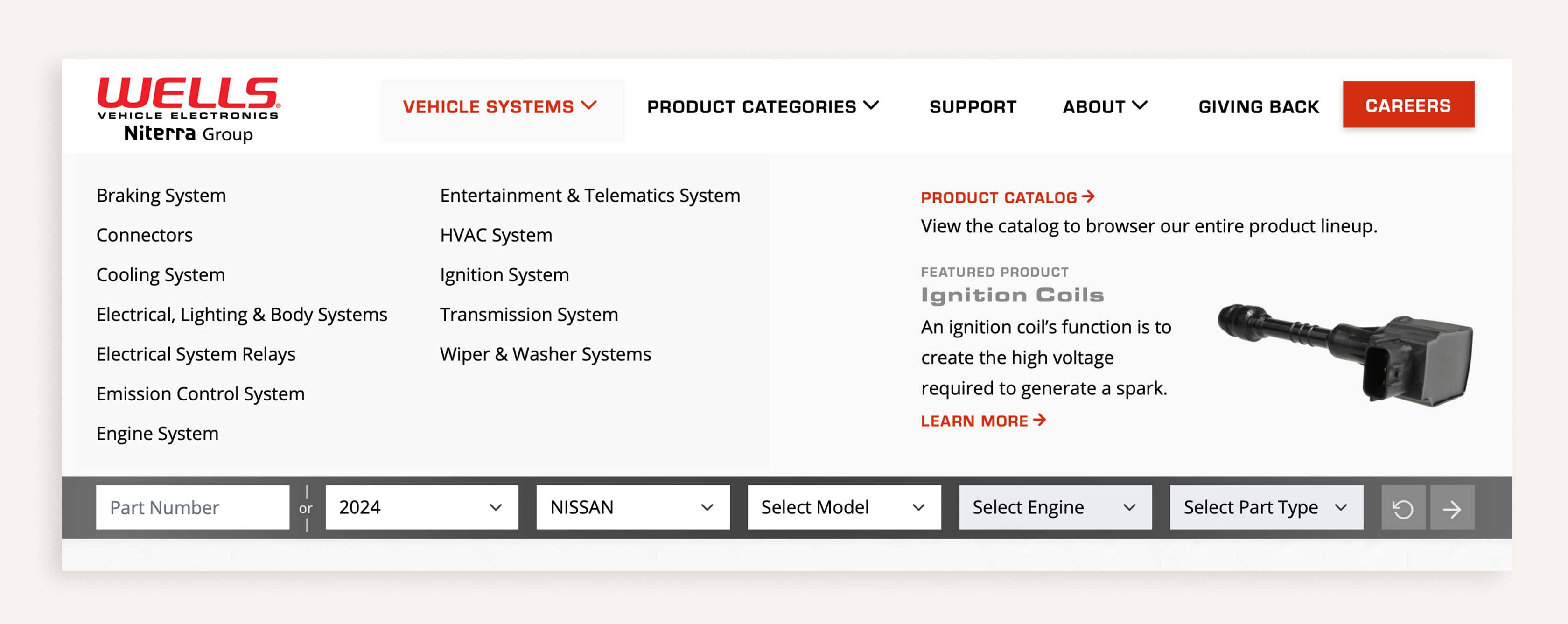
For more than 120 years, Wells VE has manufactured automotive electrical components for OEMs, repair professionals and do-it-yourselfers alike. We reimagined their information hierarchy with individual product pages, which helped drive organic traffic through search and improve engagement metrics, in addition to making the customer experience simpler and easier to navigate. More information is great — guiding users to what they’re searching for is critical.
Icon-driven navigation
Users find their way more easily through massive amounts of information with visual cues.
The Association of Equipment Manufacturers (AEM) supports more than 950 construction and agriculture equipment manufacturers globally. This demands a huge volume of content — which asked a lot of site visitors. We reinvented navigation to encourage users to discover all AEM services, making it easy for them to explore the massive volume of articles, blogs and data. Unique, relevant icons tie each category of information together visually across the site so users can quickly scan menus.
2. Build product and dealer locators
Product locators
Multiple audiences have multiple needs — give both B2B and B2C users different info for the same products.
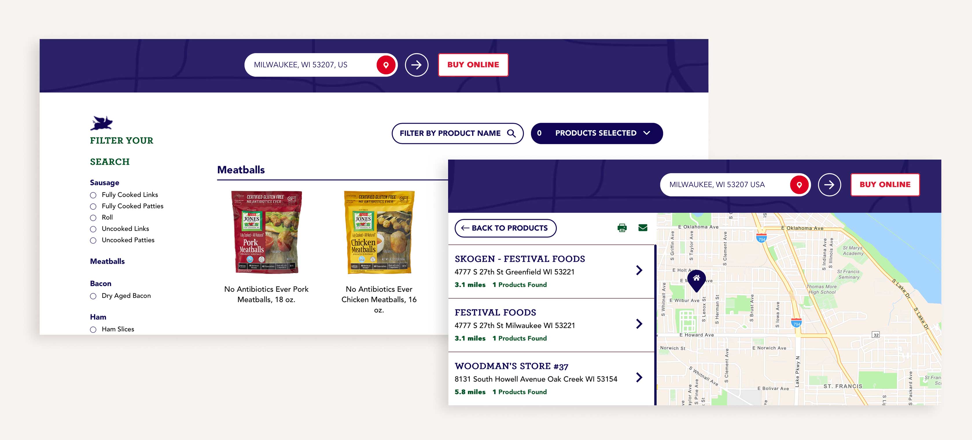
Jones Dairy Farm had a consumer-facing product finder but needed a separate section for food service companies with different features and data points, and a different structure. Consumers had unique filtering, product information and functionality for locating retail shops, while business found the right sales rep to contact. We developed pages for each need that integrated into their WordPress CMS with updated content and navigation. This additional work opened a clearer path for B2B customers to take steps toward purchase.
Dealer locator
Detailed product info is important for decision-making — once they make that decision, facilitate easier conversion.
The premier manufacturer and upfitter of commercial truck attachments, Douglas Dynamics, operates five brands across the U.S. While users could easily find dealers via these sites, the feature relies on a plugin that limits site admins’ ability to customize design and functionality. Management of dealer information is stored in that plugin, separately from their Salesforce database. We're building a custom solution that pulls details directly from Salesforce and offers greater flexibility and control with improved performance. This will give users a more direct path to purchase.
3. Add layers of interactivity
Custom animations
Encourage customers to upgrade products without alienating users of earlier versions.
High-quality surgical instrument manufacturer Gauthier Biomedical was launching a new product. They needed their site to showcase its cutting-edge technology while demonstrating how it works with existing products. Realistic product renderings presented how the new product integrated with common orthopedic tools and its core benefits in an easy-to-understand manner. A real-time feature even allows Android users to literally feel the haptic feedback in their hands.
Product lifecycle
Traditional navigation isn’t always enough — a secondary rollover way-finder can highlight process steps.
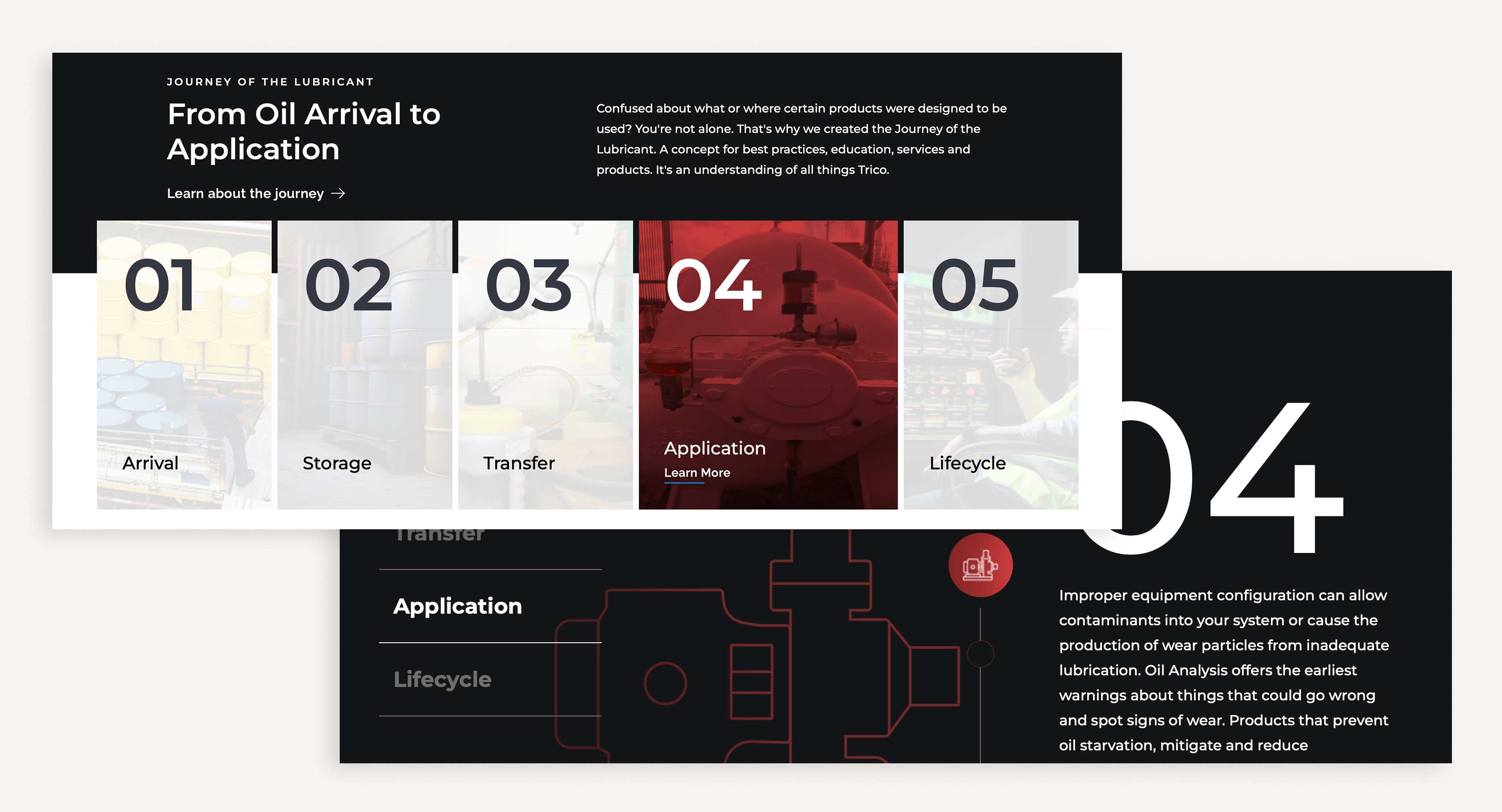
For nearly a century, Trico Corporation has kept manufacturing equipment running smoothly. Their products and services help mitigate contamination threats to lubricants and degradation of quality at every stage. We developed a custom navigation to clearly show how lubricants move through the chain-of-custody process and where Trico helps maintain high performance throughout. Diving deeper into the process showcases details with iconography and a vertical scroll that spotlights how Trico serves customers.
4. Centralize your resource libraries
Resource center
Show customers you support their buying process and ownership needs to build trust and loyalty.
Zorn Compressor & Equipment provides products and services to a range of customers, including manufacturers, food service companies, municipalities, auto shops — and many other audiences with a broad array of needs. We organized their case studies, articles, industry insights, safety data sheets and other technical product documentation, building a centralized repository of information that can be filtered by product type and industry. Zorn knows service matters, so they showcased it by giving customers easy access to product info.
Media center
Don’t leave customers frustrated — organize information for a high level of visibility and searchability.
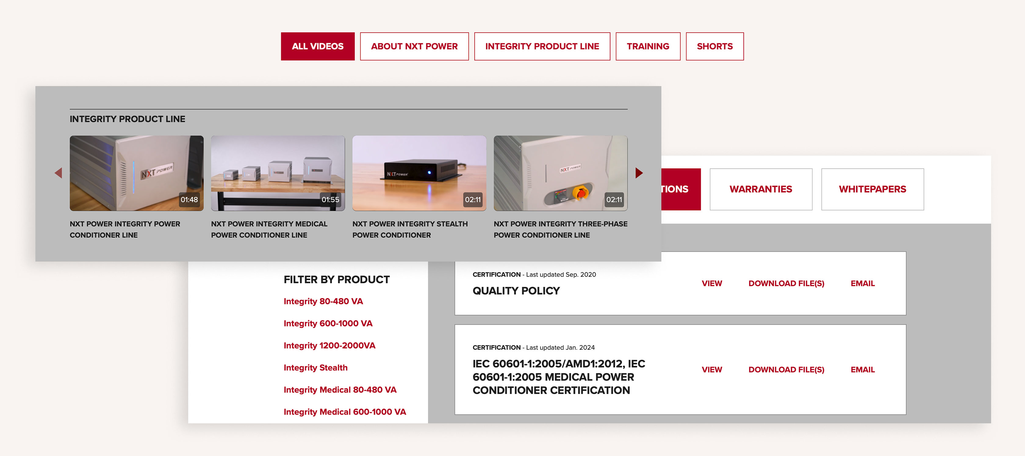
Following a site rebuild and go-to-market strategy implementation, advanced power quality solutions manufacturer NXT Power needed enhancements to showcase their growing business. We built a one-stop page to house videos that give visitors info about the company, products and services, plus training videos and shorts. All content is gated so NXT Power can control who has access while preventing sharing or viewing anywhere other than the corporate site. Most importantly, the videos support customers with helpful information and filtering functionality to easily find what they’re looking for.
5. Consider an ecommerce angle
Streamlined B2B ordering
Fewer manual tasks will make transactions easier for both customers and your fulfillment teams.
Seaguar, the leading fluorocarbon fishing line brand needed to take their shopping experience digital for distributors, wholesalers and retailers. This brand new site replaced a document-based system for a more informative, easier to use, more accurate experience. We adapted their workflow to an online process, repurposing their B2C site’s IA, UX and page designs for bulk ordering. The key was integrating Seaguar’s ERP system with 800+ accounts to the new solution. This makes the digital experience more seamless and less error-prone for external users and those behind the scenes internally.
Storefronts for end users
Some companies manufacture products that have applications directly for consumers.
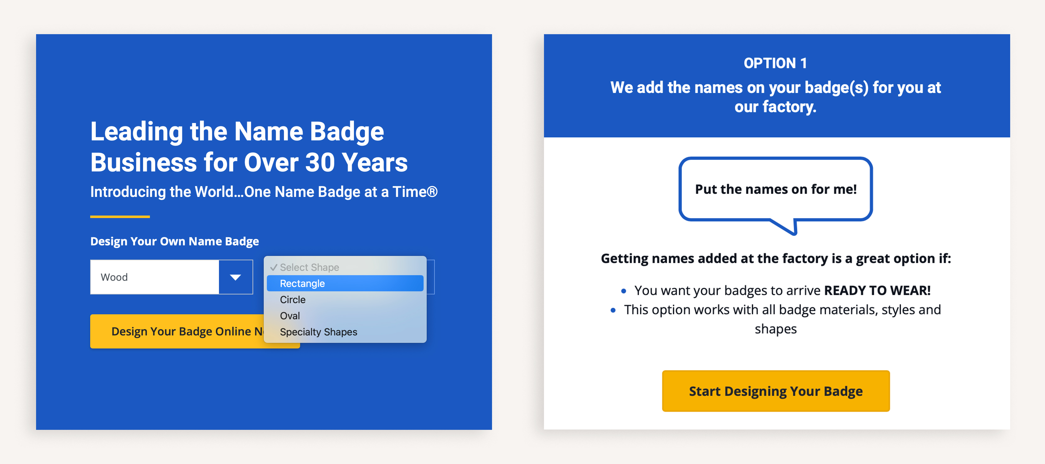
After 40+ years manufacturing name badges for global businesses, we worked with Cawley to create namebadges.com. This self-service ecommerce website adapted their enterprise B2B account service model, customer experience and fulfillment process for online small business customers. The new site leveraged existing proccesses to accommodate a completely different audience. We translated design configuration, functionality and payment with real-time support. End users can seamlessly get exactly what they need without missing out on options or quality.
Add to or reimagine your site with new features
You have several options for manageable, efficient improvements to your online presence.
We’ve only scratched the surface here — many other clients enhance their sites and make critical upgrades as needed through a flex support model.
Your continuous improvement mindset works in your manufacturing process. Apply those same principles to your digital customer experience for ongoing business growth.
Need more ideas? Want details? Contact us to talk through where your best next step might be.
Similar topics:
