Manufacturing companies are experiencing a bit of a digital renaissance as they take the spotlight in revitalizing the economy. In the last few years, many have launched D2C brands, invested in customer applications, and rethought how they showcase products.
Grow Your Manufacturing Business With UX-Driven Web Design Services
Modern manufacturers are using digital to supplement traditional lead-generation efforts while positively shaping their consumer’s perspectives on their business, process, and products. With nearly 90% of industrial shoppers researching products online as often as they are in person, a seamless omnichannel experience has become vital.
Here are the top 5 features that modern manufacturing websites must have:
1. Model your website after your buying cycle
Discovery. Research. Sourcing. Procurement: This is the model to follow.
Users will come to your website to:
- Discover what you do
- Research your offerings
- Source pricing and schematics to make sure it’s right for them, and
- Contact you for the Procurement stage, which will likely happen offline.
Your website needs to appeal to people already familiar with the business as much as new users. So, modeling the website after processes they already know is key. Committing to this process will help create trust.
2. Communicate what you do right away
When users get to your website, it shouldn’t be a mystery what you do and offer. People make split-second decisions all the time, especially online. This isn’t the time to be creative. Be precise.
Within seconds of being on your website, is it clear to visitors what you do? If not, they’ll leave for the competition. It sounds much easier than it really is. Be sure your navigation is crystal clear.
Consider this step when building a new website and filling it with content. Or, if your site already exists, then do a content audit and make things more clear.
3. Include side-by-side comparison functionality
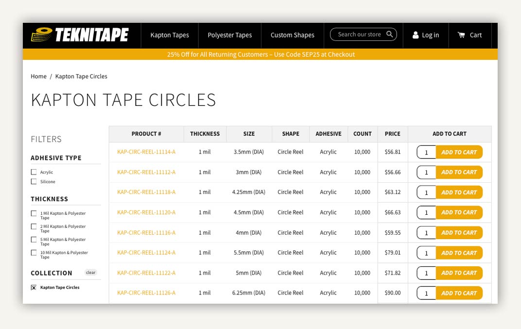
If you sell products, or offer different service tiers, users will probably want to compare before they commit. Users should be easily able to compare multiple products or services on your website. This can be a static chart or dynamic functionality. But either way a side-by-side comparison should exist as a tool or within the product page.
Pro Tip: If you’re able to house your inventory online, make sure you include a dynamic filtering system.

4. Create detailed product-level information
Speaking of product offerings, each product or service detail page should be, well, detailed. But don’t overdo it. Information should be visual, specific, and scannable.
That means having:
- Clear images from multiple perspectives (if necessary)
- Text on materials & technical specs, preferably in a bulleted list format
- Model numbers or SKUs, and more.
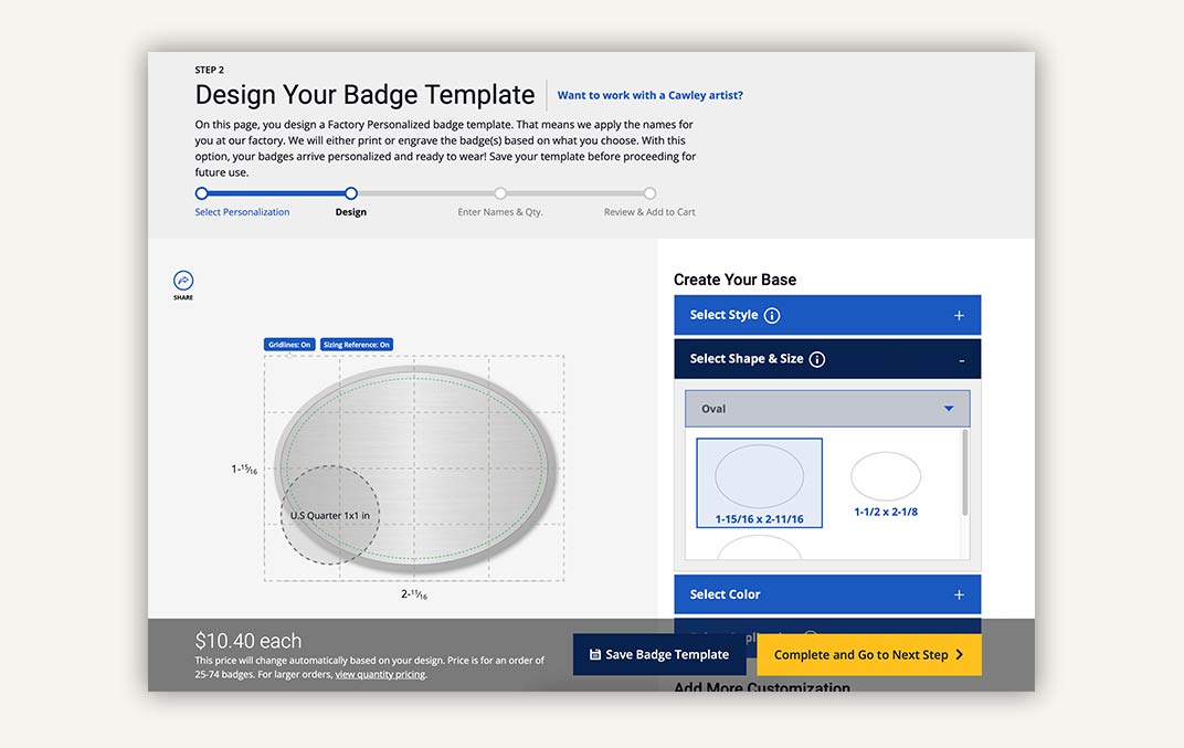
Pro Tip: If your product allows for customization, consider adding an online configuration tool to expedite the sales process (and reduce errors).

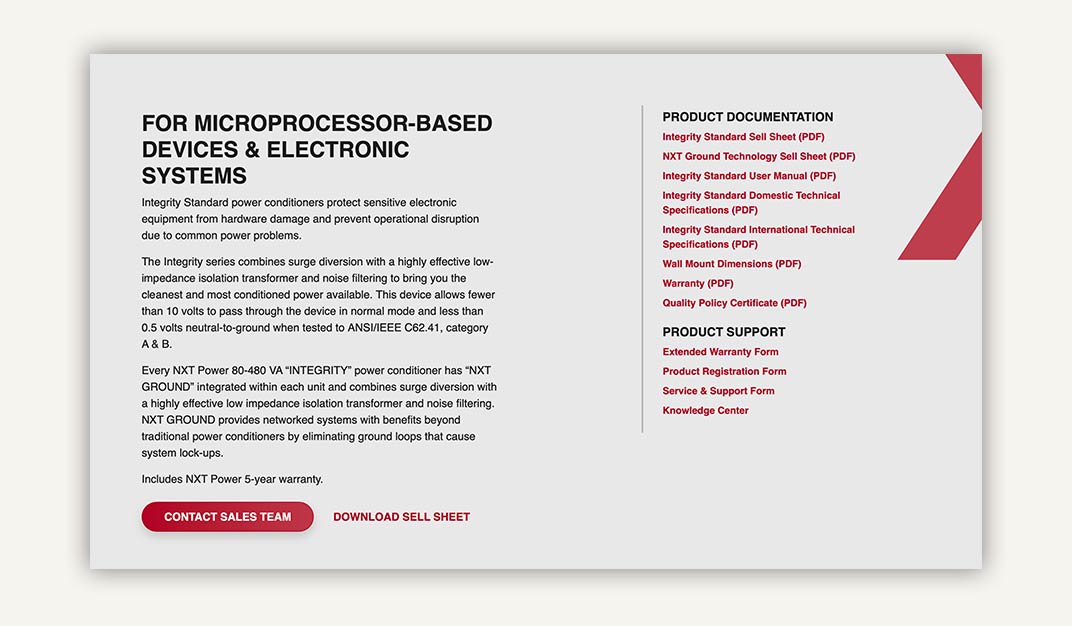
5. Have downloadable PDF content, like CAD files
Providing downloadable content can help speed up the research process for your users. Especially those that are ready to buy. They’re just double-checking if your product fits their specs. At the very least, having this content makes your website a helpful resource.
But don’t give it away totally for free. Exchange this free download for an email. This way, you can generate leads by capturing buyer information. Email marketing is a powerful tool for all industries.

Other manufacturing web design best practices to follow:
- Make sure your website is mobile-friendly
- Set up a clear navigation structure
- Simple design goes a long way
- Create compelling Calls-to-action (CTAs)
- Lean into modern design aesthetic
- Your site needs strong SEO
- “Contact Us” & “Get-a-Quote” CTAs & pages
If you were considering refreshing or redesigning your manufacturing website, or any part of your digital marketing, plan now is the time. Schedule a consultation with our pros to get started.
