One of the top reasons why businesses have left WordPress is the same reason many have returned to it — flexibility.
As mid-market brands continue to right-size their tech stack, some choose to move into different content management systems. Others simply decide to revamp how they use WordPress.
WordPress Blocks
For WordPress specifically, its component-based block editor has continued to polarize users. For novices, blocks are clunky and frustrating. But they represent a move toward a more modern, page-builder experience within the system itself.
Before this change in philosophy, most WordPress websites were built with traditional templates, which come with their own opportunities and challenges.
But for more experienced administrators, blocks have become a flexible and reliable way to build, edit and customize their websites for their evolving markets.
This is especially true for businesses that have a solid design system in place. In order to deliver an aesthetically pleasing and consistent brand image, administrators can leverage blocks within the guardrails of a custom design system.
Business advantages of designing with components
The component-based WordPress block editor won’t limit how your site can scale with your company’s strategic growth. At the same time, you’ll have flexibility to remain cutting-edge.
Here are the top benefits our clients see with WordPress blocks. When these factors align with strategic priorities, its default Gutenberg block editor is often the most efficient, cost-effective path to site success.
- Flexibility. You’re not locked into predefined page templates. With the block editor, you can mix and match different blocks to create unique layouts quickly and easily.
- Efficiency. Using standard blocks saves time, budget and resources for custom design and development where it matters most.
- Scalability. Reusing blocks and patterns of blocks across pages makes it easier to build out new landing pages as needed, or to add sections to your site.
- Easier management. Blocks empower content editors and site administrators to make updates and changes simply, more intuitively.
- Site performance. Gutenberg is native to WordPress, so you won’t get bogged down by bloated code from templates or visual builder tools.
Customizing WordPress for your brand
Standard Gutenberg blocks go a long way toward creating standard content components. However, there comes a point when customization is necessary. Especially for mid-market and enterprise-level organizations.
More advanced features and design elements like mega-menu navigation, post filtering, animations, forms and more intricate designs require the creation of custom blocks, patterns and page templates.
A few examples of Lightburn’s approach which balances standardization with customization.

Use Case #1
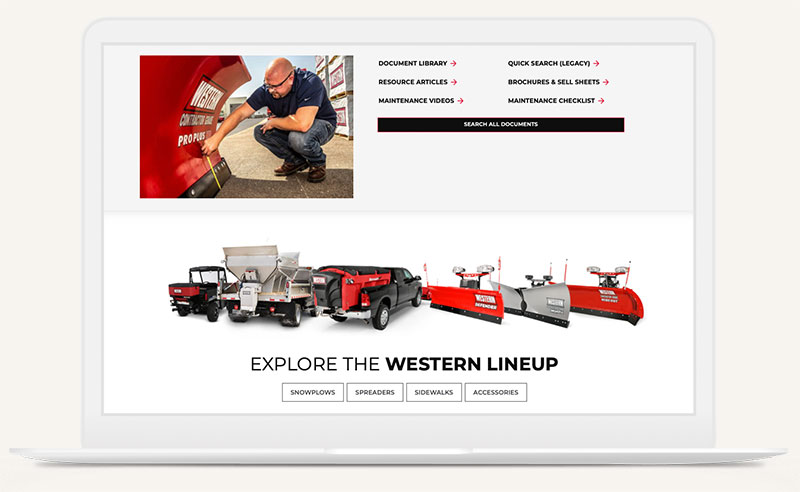
Our manufacturing client needed to stand out with new content and simpler navigation.
We walked their team through the pros and cons of all potential CMS solutions — they decided to stick with WordPress, although moving from its Elementor editor to the more streamlined Gutenberg. UX & design guided the rebuild with wireframes and solutions to integrate dynamic media, helping site administrators make edits more efficiently.
Use Case #2
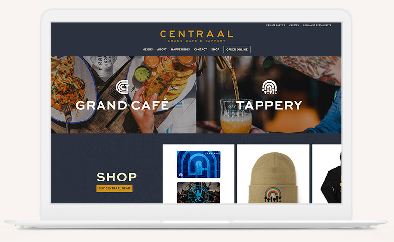
A Wisconsin restaurant group’s collection of websites lacked cohesion for both users and admins.
We started by building them a free-standing retail store for merchandise, then followed up with five unique yet inter-connected brand sites for their corporate and restaurant concepts. Our team helped select a set of 12+ custom patterns and blocks using Gutenberg. These carefully chosen patterns future-proofed each site with flexibility to ensure they could achieve an endless combination of content.


Use Case #3
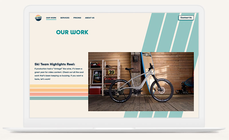
A video content agency wanted to level up their website with a flexible project portfolio.
Using our own WordPress theme, we created an engaging site that showcases their depth of industry experience. Users can explore the agency's client list, common video challenges, case studies and services. By focusing on both form and function, the portfolio page showcases their work without overwhelming users, boasting scalability to house long- and short-form projects. Finally, we built a filtering system for easy browsing of projects by type and by budget.
Any of these challenges look familiar? Want to make your site simpler even while it performs better?
Get in touch to discuss whether Gutenberg blocks with customization might be your best option, or if another platform will get you what you need.
