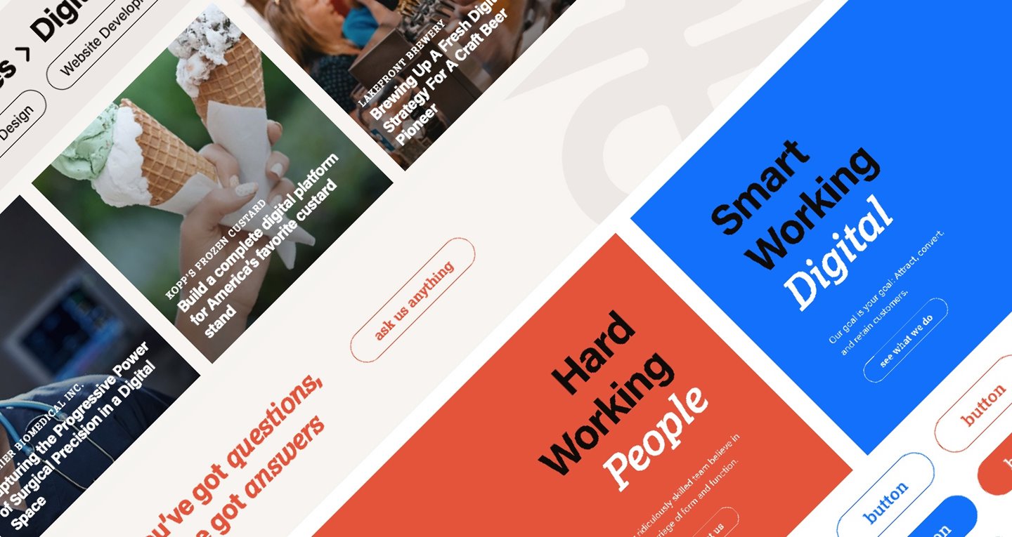
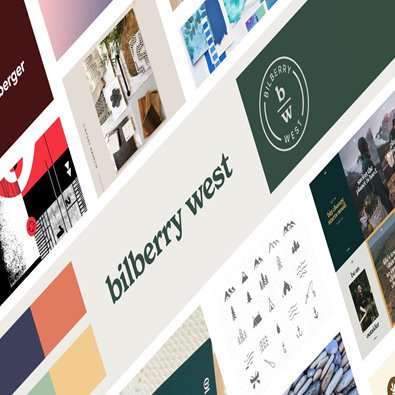
After countless iterations, and nearly five years of tinkering with the idea of evolving our brand, we're excited to have a look and feel that truly feels like us.
So how did we get here?
This time around, things came naturally.
Join Lightburn partner, Nora Lahl, and lead designer, Caitlin Mackey, as they introduce the evolved Lightburn brand and new website. During this informal chat, they will discuss the web development process, what inspired us, the challenges we faced, and how we brought our new website to life.
Topics Incude:
- Design Philosophy
- Navagation & User Experience
- Logo Evolution
- Typography & Color Choices
- Overall Project Process
Instead of trying to complete this internal project in bits and piece around our regular work, we did it right and treated ourselves like any other client. That meant starting our full process from the beginning with a deep dive into who we are and what we want our audience to know about us. This led us to the following design philosophy:
We're experienced
- We're conveying our nearly 25 years as a digital agency.
- Reduce visual noise and over the top graphics that distract from who we are.
- Let what we had to say (and show) speak for itself with confidence.
We're approachable
- We've created a design that speaks a common language.
- Make the navigation incredibly clear, make the color pallet energizing and friendly.
- Opt for high vibration colors and warm neutrals that are inviting.
We're invested
- We wanted a design that expresses our passion.
- We wanted pixel perfect. The spacing is precise. The typography is on a scale.
- The design is thoughtful and to the point.
If you already know Lightburn, we hope you're nodding along vigourously. And if you don't know us yet, we're putting our best foot forward and we hope you like what you see.


.png?resizemode=force&width=395&height=395)
