As developers, it’s crucial we stay up to date on the latest creative, technical, and strategic web design changes in the industry. Sometimes this means learning a new design tool, project management platform, or digital marketing tactic.
But sometimes, it’s an entire web design philosophy or best practice that evolves, and it fundamentally changes the way web practitioners understand how users think about and interact with the internet.
Here are five web design trends or, more accurately, evolutions of trends that we have seen a lot of in the last 12 months, and expect to continue seeing the rest of this year.
Embracing Dark Mode
Don’t be afraid to go dark.
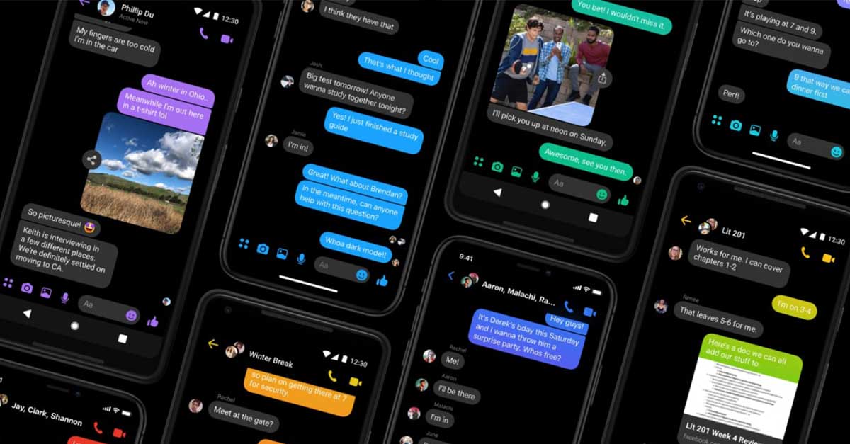
Embrace the increasing popularity of dark mode, night shift, and other low-light interface options and design UIs anchored in bold, dark colors. This can mean designing your app or website fully in dark mode, like the Blocs website does beautifully, or providing the option for users to switch between dark and light modes, like Johny Vino’s website does.
Dark backgrounds paired with white or light text create a low-contrast interface that is pleasing to the eye, particularly in low-light settings. Low-contrast interfaces also help reduce user eye strain and help important pieces of content, such as an article summary or emergency message, stand out more.
When it comes to color choice, the possibilities really are endless; there’s more to dark mode than just black backgrounds and white text.
In fact, that extreme of a color pairing may provide too much contrast that creates a glaring or vibrating effect, so feel free to explore variations of black, blue, red, gray, and green paired with light text like off-whites and grays.
Crafting simplistic shopping experiences
It’s a well-known pandemic narrative that brick-and-mortar businesses (or those with middling online presences) have had to swiftly move commerce online. With all these companies now conducting business on the web, it’s more important than ever to stand out with a shopping or booking experience that is as fast and painless as possible.
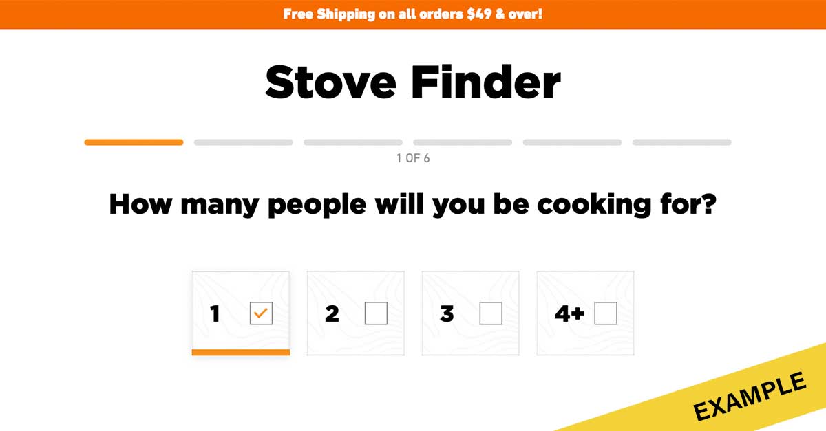
This might mean easy checkout processes on all devices, faceted product infrastructure, alternative payment methods like Apple Pay, financing solutions like Affirm or AfterPay, chatbots and real-time customer support, personalized content, multiple shipping options, and old standbys like ‘Add to Cart’ functionality on category pages and crystal-clear calls-to-action.
Simple to use does not necessarily mean simple to build. Consideration and restraint will help you deliver the best user experience.
Building interactive experiences & micro-experiences
These days, interactivity is an essential part of the UX and content design puzzle. Users have come to expect and desire dynamic, moving, personalized, and animated elements on a business’s website, so it’s no longer a nice-to-have but a must-have.
Interactivity can refer to movements within the UI like hover states, parallax scrolling, particle backgrounds, animations, and fun or unexpected microinteractions, like Climber’s website has.
But it can also refer to user-content interactions, such as product finders, product configurators, questionnaires, reviews, and other dynamic elements that provide value and create interest for the user.
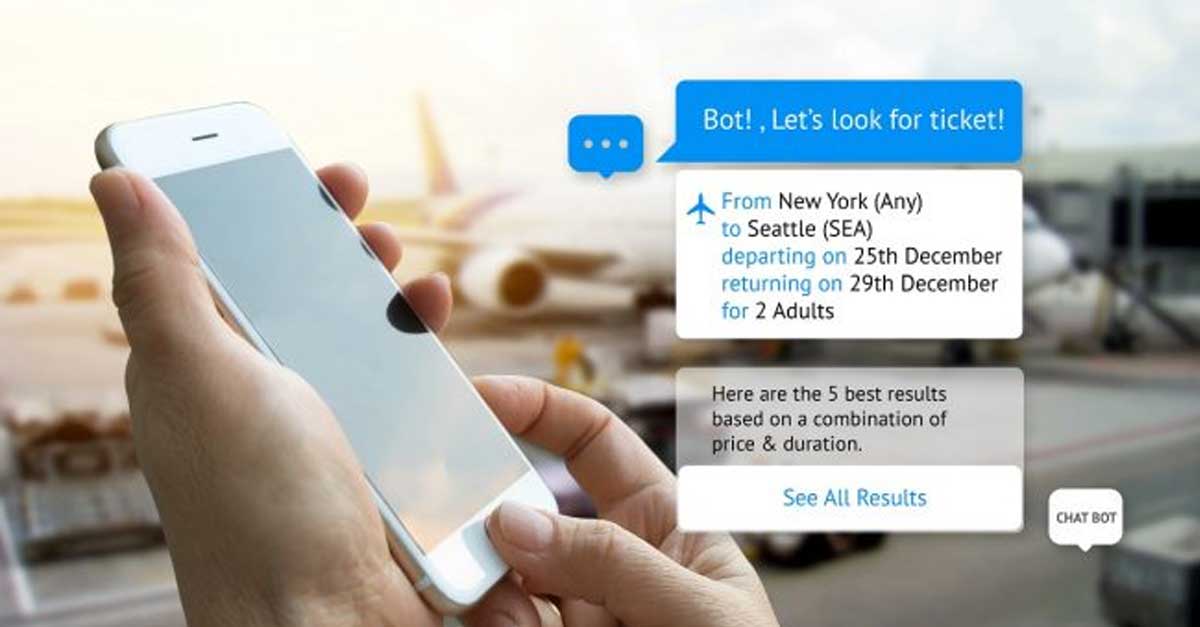
Take product finders, for example. By offering users the opportunity to answer a few multi-choice questions and funneling them to relevant products, you can make them feel knowledgeable and empowered, as if they are making informed purchasing decision without having to do any actual product research.
Thus, something as simple to design and build as a product finder can guide users to accurate, targeted content or products with little effort on your part. See Jetboil’s Backpacking Stove Finder for an example of a high-value product finder.
Simple, helpful interactions and mini experiences like these can help your brand build trust and engagement with your users before they even provide an email address.
Consider thoughtful use of multimedia
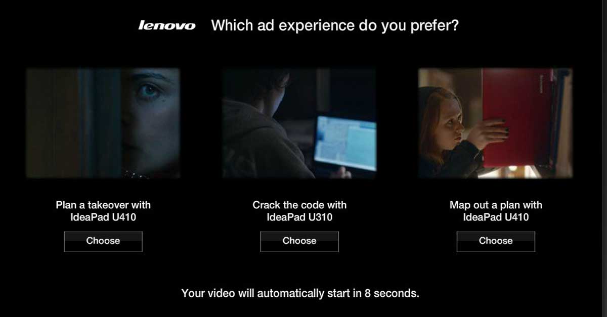
Similar to interactivity, multimedia experiences on websites are a given in 2021 and beyond. Text, images, galleries, videos, audio, quizzes, and other interactive elements contribute to a rich and varied user experience and help bring your brand, products, and services to life.
What’s trending lately, though, is the thoughtful, careful, and even restrained use of multimedia in web experiences. This means more and more brands are catching on to the fact that simple and accessible media is best, and that one or two really strong media- or interaction-based features will beat out 10 subpar ones every time.
Let’s take a simple example, such as a customer video testimonial. It’s no longer enough to simply embed a video from your YouTube channel on a relevant web page and call it done.
In addition to being strategic about how the videos look and what they say, it’s just as important to be strategic and thoughtful about how they are served up to users and what kinds of helpful and accessible features accompany them.
In addition to careful consideration of distribution and placement, a thoughtful and accessible video experience might also include:
- Clear “play” and “pause” buttons—no autoplay
- Clear and logical volume/mute input
- Full audio transcript
- Closed captioning
- Pull quotes, highlights, or takeaways
- Video title and description
- Video metadata like duration, topic/s, author or speaker, publish date, and more
- Links to related or mentioned resources
- Ability to download for offline use
- Other related or relevant videos
While not all of these features are required per se (see required ones here), these are just some of the elements that you might use to make a simple testimonial video more purposeful and accessible.
Offer web accessibility
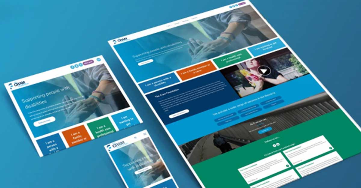
Public service announcement: Web accessibility is not a trend. Nor is it going anywhere any time soon.
Designing websites and digital experiences in a way that people of all abilities can easily access and navigate is a fundamental responsibility for all digital professionals.
One of the most beautiful things about the internet is its universality, its fundamental mission of gathering, organizing, and making all the world’s information available to everyone. If we’re not designing web content that, truly, everyone can access in some way, we’re undermining one of the founding principles of the modern internet.
However, we’ve been thrilled to see how many more companies have begun embracing web accessibility and requesting fully accessible website designs in the last year or so.
We’re optimistic this newfound dedication to designing accessible digital experiences will become the new norm and less of a “box to check” or an item on a to-do list when launching a new site.
Other top design trends
Web design is still best led with form and function, however, businesses are replacing bulky graphic design with some playful flair by:
- Adding illustrated or animated characters on culture or 401 pages for a bit of fun
- Creating small mini-games or scavenger hunts within the user experience
- Building s sleek, one page websites that make the user feel like they are reading a menu or poster
Other trendy design elements include:
- A decrease of hero images on homepages
- An increase in bold, oversized typography
- The use of interactive fonts
- The use of illustrative collages
- Abstract illustration and glassmorphism
Ready to take your digital design to the next level? Let us do the heavy lifting. If you’re interested in hearing more about our design philosophy and approach, get in touch us at (414) 347-1866 or via email at [email protected].
