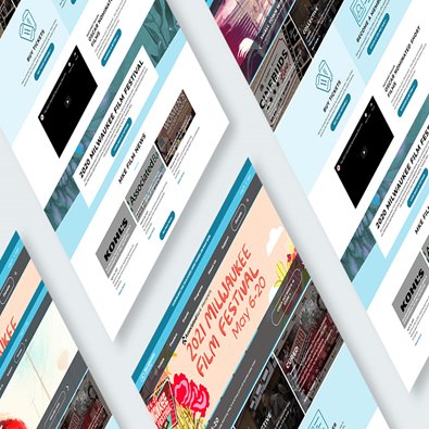
It’s very easy to get lost in the weeds when you’re considering a website refresh or redesign.
The hardest part is finding a balance between want and need. The grand plan versus the reality. We know from experience that it can be a fine line and an uncomfortable one at that. It’s difficult to set aside individual opinions and focus on the needs of the business and, perhaps more importantly, its users.
The best way to navigate your options, is exactly that.
Are you refreshing or redesigning your website for you or your users?
This question alone can help you determine how complex your website refresh or redesign is going to be. If your business has rebranded and needs to update the aesthetic look and feel of your website, you may be ready for a refresh. In these cases, you aren’t changing the fundamental construction or footprint of your website. However, if you need to change the navigation, or structure of your website to better suit your customers or clients, then you’re likely looking at a redesign. A full redesign ultimately means redevelopment.
To help you quickly make this determination we’ve created a color-coded checklist to help you understand the complexity of tasks and how quickly they may push you from refresh to redesign.
Task Checklist
If tasks are primarily green, then you will be leaning towards a website refresh. As complexities increase, and orange or red tasks become more complex, you will be leaning towards a website redesign.
Website Refresh |
[ ] Has your brand changed?
[ ] Logo?
[ ] Color Palette?
[ ] Are you adding a texture or pattern element?
[ ] Are you updating images?
[ ] Are you updating copy?
[ ] Do you need to update metadata?
[ ] Do you want to move existing elements (widgets, images, text) on page?
[ ] Do you want to create a better mobile experience?
[ ] Do you want your site to be more responsive?
[ ] Do you need to change the navigation?
[ ] Do you need to add a feature
[ ] Are you adding a new location, product, service types?
[ ] Do you need to optimize or update content?
[ ] Do you need another page type?
[ ] Do you need new elements (widgets, images, text)?
[ ] Is your CMS up to date?
[ ] Are all of your themes up to date?
[ ] Are all of your themes or plug-ins still supported?
[ ] Is any third-party technology involved?
[ ] Ecommerce platforms?
[ ] MarComm software?
[ ] Does the fundamental code on your website need to be fixed?
Website Redesign |
The fine line between short-term need and long-term gains
The biggest concern when navigating these questions is going to be time and money. From a business perspective, you don’t want to be shortsighted. You also don’t want to over invest.
Timing considerations to help you move forward:
- If all your needs are purely aesthetic (green in our list above), a refresh project may be possible in just a matter of weeks.
- As you start to tip into more complex (orange) needs, you might be able to tackle the smaller technical tasks with a maintenance or support retainer, allowing you to spread your investment over time.
- If any of your needs are complex (red), then you’ll need to allow time for some or all of the site’s structural components to be rebuilt. It will be important to future-proof this type of work with a fresh code base as much as possible, or you run the risk of investing in efforts that aren’t built to last.
With any web design or development project we recommend starting with the quick wins. You should be cognizant of your long-term goals while keeping an eye towards the practical as well. Once you’ve determined exactly what your true business needs are, you’ll be able to swiftly move forward.
Interested in learning more about web design, maintenance, and support? Sent us an email at [email protected] to set up a free consultation.


