Whether you’re starting a new project or maintaining an existing one, there are a number of “small wins” that will cover the vast majority of common issues without blowing your annual budget. If automated and manual testing do not report any issues with the following, then you can safely state that your website is accessible.
Throughout the following there will be references to the Web Content Accessibility Guidelines (WCAG), which are considered the standards that anyone should follow. They are still just guidelines though.
1. Choose high contrast colors
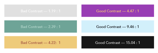
Do not rely on color alone to convey meaning. An estimated 5-10% of the global population has a color vision deficiency. WCAG 1.4.3 states that the visual representation of text or images of text should have a contrast ratio of at least 4.5:1.
This is best accomplished in the early stages of design, when color palettes are still being determined. Often brand colors are incorporated, which can add some complexity, but is still important to get right as contrast issues are among the most reported issues with automated testing tools.

2. Build Semantic HTML
This is almost entirely on the backs of your developers.
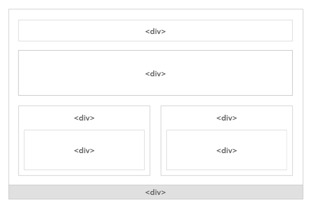
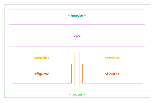
Certain HTML elements convey implicit meaning and have explicit interactions that are critically important to assistive technology. This is a situation where having someone inexperienced “fill in” for this role can be problematic, as getting the semantics wrong can cause accessibility issues from start to finish.
Invalid or incorrect semantics are also often reported by automated testing tools.


Building off of the semantics mentioned above, heading order is critically important to understanding the structure of a web page. Much like writing a document outline in Microsoft Word, the headings on your page should be in an order than convey structure. Reference WCAG 2.4.10. Of course, in addition to accessibility, proper heading order is important for SEO.
3. Alternate descriptions for content images
Images (that aren’t purely decorative) need to have an alternate description to pass WCAG 1.1.1.
Visually impaired users may not be able to see the image, and when using assistive technology the image alternate description will be read to them. It’s important to note that the description should describe the contents of the image itself, not the name of the image file or the context in which the image is used.
Pro Tip: Images referenced through a content management system do not always make fields for adding alternate descriptions readily available, which is why it's vital to know how your platform is being used before choosing one.
4. Descriptive content links with clear design
It’s very common to have some bit of design with repeated elements, and often if a link is involved it’ll contain the same text each time. This is an issue with WCAG 2.4.4, because the link purpose should be determined from its own text.
One common solution to this is to include additional context for screen readers only, which maintains a visually pleasing balance without having a bunch of links on the page with the exact same text over and over.
5. Add captions for embedded video
Captions are required for all video content, whether it is prerecorded (1.2.2) or live streaming (1.2.4). This can be particularly challenging as it often requires quite a bit of additional effort. Self-hosted videos give you manual control over the subtitles, while using a third-party service like YouTube can provide automated subtitles that may or may not be at all effective.
Providing captions for a live video feed will often require hiring a specialized service.
6. Create keyboard shortcuts!
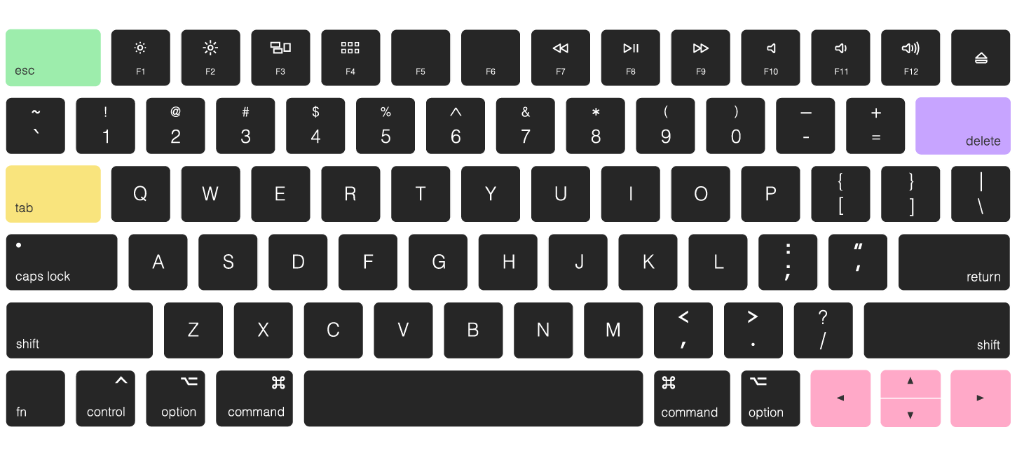
If your website is fully accessible via keyboard navigation then most, if not all, assistive technologies will also be able to navigate it. This topic encompasses multiple guidelines, and is probably one of the most critical accessibility efforts for you to invest in.

7. Add an official accessibility statement with a form
An easy way to provide some legal shielding is to have a dedicated page stating your commitment to accessibility, with a form for users to submit issues. This page should be easily accessible, either in the primary navigation or in the site footer. Not only will this help bring issues to your attention but, in the event of a lawsuit, will provide proof that you have had an ongoing interest in providing an accessible experience.
Web accessibility can vary widely but ultimately most of their core requirements are web development best practices. To learn more schedule a consultation with one of our web development and accessibility experts.
