It is extremely easy to find yourself stuck in the weeds when you're designing a website homepage. More often than not, stakeholders and department leaders will fight over its real estate and hierarchy.
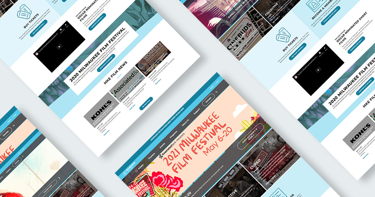
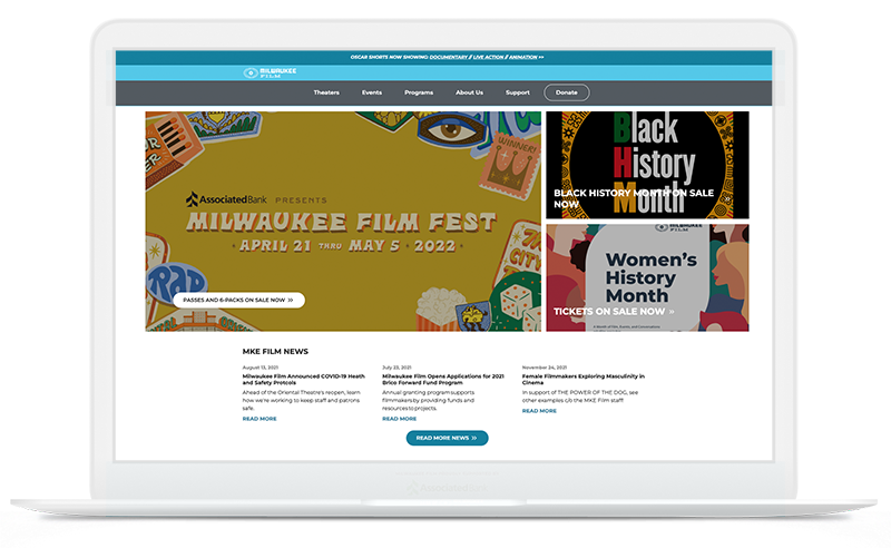
The homepage will likely be the most viewed page on your website, but does that make it the most valuable? The short answer is no. For the long answer, let's explore a recent homepage redesign we did for our good friends at Milwaukee Film.
A little less conversation, a little more action
Milwaukee Film is a nonprofit arts organization that both entertains and educates, but the most valuable action on its website is ticket sales. Even though they were getting a lot of traffic to their homepage, this traffic was not necessarily increasing the bottom line.
The question became: What was missing?
After conducting a comprehensive internal survey, we found that the homepage was simply trying to do too much. Every department leader wanted to put a stake in the ground, which became overwhelming and confusing for visitors. The homepage had grown legs of its own.
Over the course of many years and some significant internal changes to the organization, the messaging had become overly crowded. It was not immediately clear which action they wanted their audience to take. When you give your audience all of the information, you're asking them to wade through it — and many simply leave.
An exercise in hierarchy
Not all content is created equal.
To best retool the homepage, we needed to focus on actions with the largest audiences and highest returns. Homepage content had to lead to trailers, clips, and most importantly, ticket sales.
Secondary and tertiary topics had to rely on their own individual landing pages which were edited to be more dynamic by keyword and content type. This conversational shift allowed each topic to stand on its own for visitors who were interested in learning more about Milwaukee Films wide variety of topics.
Pro Tip: Be sure your website's internal pages are strategically focused on one topic, keyword, or solution. A user who is searching for those particular topics will likely enter your website through supporting pages and may never see your homepage. This is why paid advertising is more effective when linked to internal pages that are the most relevant to the user.
Customizing Kentico
To create an intuitive design, we redesigned the homepage directly in Kentico. We stopped using widgets to auto-feed content from child pages and removed image sliders. We simplified the design layout by focusing on news, long-term goals, and general experience.
Our goal was to help reset their materials to a manageable scope. Once complete, the internal team at Milwaukee Film will continue to create posts, upload images, edit content, create links, and promote content.
Long-term support
Many nonprofits and some service-oriented businesses try to hit every button and fail. Over time, the stylization and implementation of assets fluctuate for better and for worse. This had been the case for Milwaukee Film.
To help reinforce core brand guidelines and support their long-term goals, we created multiple feedback loops for maintenance and support. We created a style guide for graphical elements, coded tool tips directly into Kentico’s content management interface, and created modified workflows for their team members.
We have always loved working with Milwaukee Film and will continue to support their overall mission; to entertain, educate, and engage the community through unique and diverse cinematic experiences.
Interested in learning more about web design, maintenance, and support? Give us a call at (414) 347-1866 or sent us an email at contact@lightburn.co to set up a free consultation.
